Mobile devices have become an integral part of our lives, and they have significantly changed the way we interact with websites. As a result, it is essential to optimize your website for mobile devices to ensure that you are reaching your target audience effectively. Here are some tips you can use to optimize your site for mobile devices:
1. Use a Responsive Design
A responsive design is one of the most effective ways to optimize your website for mobile devices. A responsive design means that your website will automatically adjust its layout and design to fit the screen size of any device. This way, your website will look great on all devices, whether it is a desktop computer or a small smartphone screen.
2. Optimize Your Images
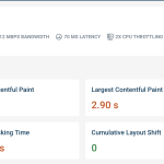
Images are often the main culprit when it comes to slow-loading websites. Optimizing your images for mobile devices means compressing them and reducing their size to ensure fast loading times. You can also use responsive images that will adjust their size according to the device’s screen.

3. Use a Fast Loading Speed
Mobile users are often on the go and expect fast loading times for websites. To ensure a fast loading speed, you can minimize the number of HTTP requests, remove unnecessary plugins and files, and use a Content Delivery Network (CDN) that can help distribute your content across multiple servers.
4. Simplify Your Navigation
Mobile users often have limited screen space and cannot browse through a large number of menu options. Therefore, it is essential to simplify your navigation menu and only include the essential links. You can also use a hamburger menu to hide your navigation in a collapsible menu, saving valuable screen space.
5. Use Easy to Read Fonts
Reading text on a small screen can be challenging, so it is crucial to use easy-to-read fonts that are legible on mobile devices. Sans-serif fonts are recommended because they are easier to read on smaller screens.
6. Make Use of White Space
White space is essential for mobile optimization as it helps to break up the content and make it easier to read on small screens. Using too much content on a small screen can be overwhelming for mobile users, and white space can help to balance it out.
7. Use Mobile-Friendly Pop-Ups
Pop-ups can be an effective way to capture leads or provide important information, but they can also be annoying if not used correctly. Using mobile-friendly pop-ups means they should be easy to close, not take up too much space, and not interfere with the user experience.
In summary, optimizing your website for mobile devices is crucial to ensure that you are reaching your target audience effectively. You can use a responsive design, optimize your images, use a fast loading speed, simplify your navigation, use easy-to-read fonts, make use of white space, and use mobile-friendly pop-ups to ensure that your website looks great and functions well on all devices.


Leave a Reply